Color Concept - Analogous Colors
The main color palette for this piece leans towards the cool side with the abundance of greens and blues, but also with tints of yellow and orange as well. These analogous colors take up over half of the color wheel, from blue to red-orange, an 8 color palette. Jun utilizes these colors to emphasize the character Jack's main color theme, blue-green and golds, especially using the golds to give off an ethereal glow. (Pandora Hearts Vol 7 cover)
Color Concept - Monochrome
Utilizing just shades and tints of one color this time around, with the only deviation being for the small amount of skin color around Elliot's face, Mochizuki turns to monochrome blue-green for this piece. The different shades in the gradient area of his jacket represent the soft specularity of the lighting for the scene, the blue giving out a calm vibe, whereas the sword and Elliot's expression serve as contrast. (Vol 14 cover)
Color Concept - Complimentary Colors and Saturation
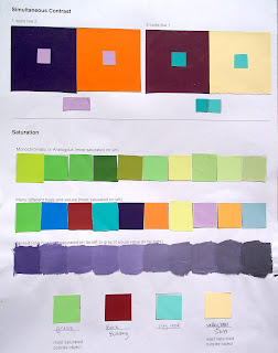
For this piece, Jun demonstrates the use of the complimentary colors violet and yellow, as well as a depth saturation technique in the falling yellow stone pieces. The violet's highlight the character Levi's association with the Abyss (a hellish dimension often referenced/visited in the manga) and its Will, and the breaking chains and stone represent his acceptance of his body's* death, and passing on the persona of Glen Baskerville to the next chosen . The vivid purples and its yellow contrast give the image a pulsing, almost evil feeling, further implying his connection to the Abyss, but also belying his slight insanity and remorseless actions. (Vol 18 cover)
Color Concept - Color Tetrad
In this image Mochizuki relies on the color tetrad of green, blue-violet, red, and yellow-orange. The yellows bisect the center of the picture, giving Oz his green and blue-violet shadows, showing his connection to Jack, but the reds from Alice are slowly replacing them, indicating where his loyalties lie and actually foreshadowing a rather big reveal later in the series where Oz and Alice's character roles are reversed. The four colors shown can be divided into complimentary pairs of red/green and blue-violet/yellow-orange, the small sliver of bv/yo really draws focus from the surrounding r/g palette. (PH Guidebook)
Color Concept - Color Emphasis
This piece returns to the blue-dominating palette, but with a small section for the golds of Oz's hair, really emphasizing him as the main character in both the image and the series. The blues color the symbols of events going on in the series, while the yellows and skin tones highlight the important figures, Oz, and his best friend/valet Gilbert. The blues are also used to bring out the dark grays and black areas in their military style clothing, giving them a sharp yet dangerous vibe, considering the constant fighting for their lives in the storyline and Oz and Gilbert's positions as high ranking officials, it ties in well with the tone of the series. The green text also brings out the green in Oz's eyes. (Color Page Manga Spread)
Color Concept - Warm Temperature
The last piece is centered around a warm color palette, also drawing out some subtle compliments in Alice's purple eyes and green tinted hair. The golden light theme is continued here, tying into the main plot point of the golden dust only the Baskervilles can see in the air throughout the story. The background is dark in contrast to the light coming from Alice, and since she is so closely tied to the Abyss, the dark background symbolizes the regular world, and the golden light symbolizes the previous form of the Abyss dimension before certain story events, one only past generations of the Baskervilles had witnessed. The warm palette is happy and inviting, just as is Alice's open-armed pose, drawing one's gaze up to her cheerful face. (Vol 24 cover)


